How to Add Dynamic Constraints to Your Swift Project
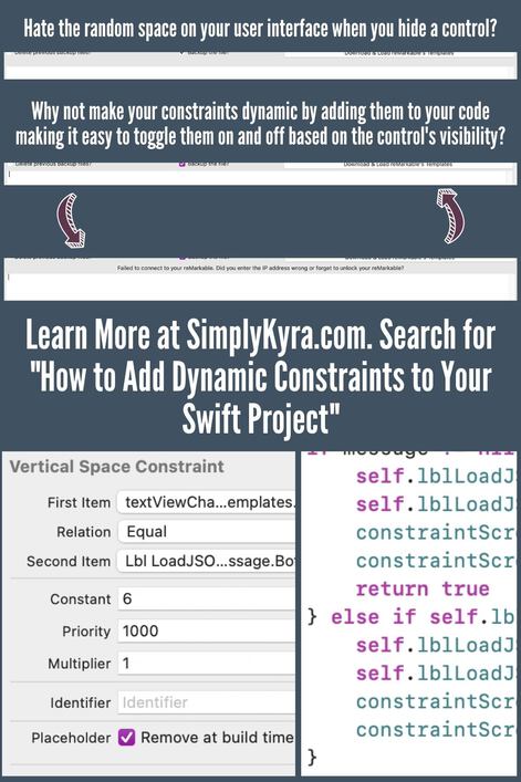
Over the last couple weeks I’ve been working on a MacOS prototype application using the Xcode IDE and the Swift programming language. The other day, when playing around with the layout and logic behind my controls, I realized that I needed to make one of the constraints more dynamic as the static logic on the interface builder was causing a blank space to appear whenever I hid one of my labels. I wanted the control underneath that label to be moved up so that the space would be covered up whenever I set the label to be hidden. I also wanted that same control to be moved down whenever I did need to use that label to show a message to the user. I decided to hunt down how to make this particular constraint seem more dynamic and came up with this solution. I wanted to share it with you in case you’re also looking to make your own constraint a bit more dynamic too.
At this time I am running Xcode version 12.5 (12E262)
Over the last couple of weeks I’ve been working on a MacOS application using the Xcode IDE with Swift. I’ve more recently started overhauling the front end of my application, specifically using the interface builder on my storyboard file to move around my controls and quickly realized that I needed a more dynamic version of one of the constraints that was a little bit too restrictive for me.
As a quick aside if you want to read more about working with constraints in the interface builder you can check out Apple’s Document Archive: Auto Layout Guide.
Setup
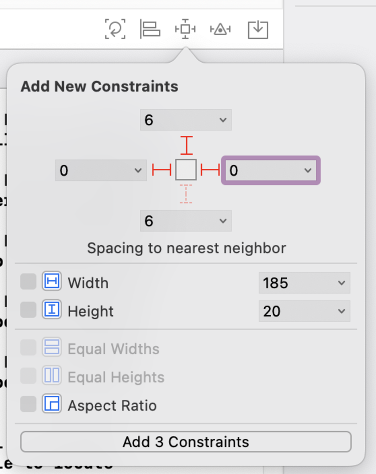
Specifically, for this particular layout, I used controls that spanned the entire width of my application’s superview. The label causing the issues here was created to display any error message if my code wasn’t able to execute as the user might expect. Above it I had a horizontal stack view showing two checkboxes and a button while below the label I placed a scroll view, containing a text view, so the results once the button was pressed could be displayed. After putting the controls down on the main view I started from the top and worked my way down using the Pin Tool on each control in turn so they’d be positioned 6 spaces down from the one above it and their sides, both the leading and trailing edges, would be flush against either side of the superview. Finally, once I got to the bottom control, I set all four of it’s constraints so it would be pinned to the sides, top, and bottom.

Discovery
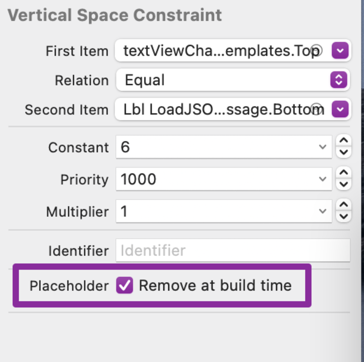
I saw no issues when setting this up; however, after setting up the logic to hide the label if there’s no error message to display, I noticed when running my application that a blank space remains where the label was whenever there’s no message. Ideally, I wanted that space to shrink so the label essentially disappears leaving no trace so I decided to hunt through the Document Outline to find the offending vertical constraint that’s set between the label and the scrollable text view and then perused through it’s attributes.

While looking through the attributes for that vertical space constraint I didn’t see any obvious way to make the constraint more dynamic but I did spy a checkbox labeled Remove at build time. I quickly realized, which I had already been wondering, that the solution was going to be in the code and not in the interface builder itself. Rather than deleting the constraint right then and screwing up the layout shown in the interface builder I instead checked off Remove at build time so the interface builder would still see the constraint but that constraint won’t be in my way when working through the logic of the label within the code later.
I didn’t take a photo but once this constraint was removed, shown at runtime, the scrollable text view below the label disappears and I’m left with a blank space at the bottom of my application window. I wasn’t worried as I knew this would be a temporary issue.
Search
I then hopped back online to see if I could figure out a way to programmatically create my constraints. I knew I wanted to create two individual constraints and toggle between them within my code. I wanted one that was assigned to the vertical space between the scrollable text view and the label itself (like I had in the interface builder) that would be active when the label was visible. I also knew I wanted the other one assigned to be the vertical space constraint between the scrollable text view, again, and the horizontal stack view, above the label, so when it’s activated the scrollable text view would be moved up covering the hidden label.
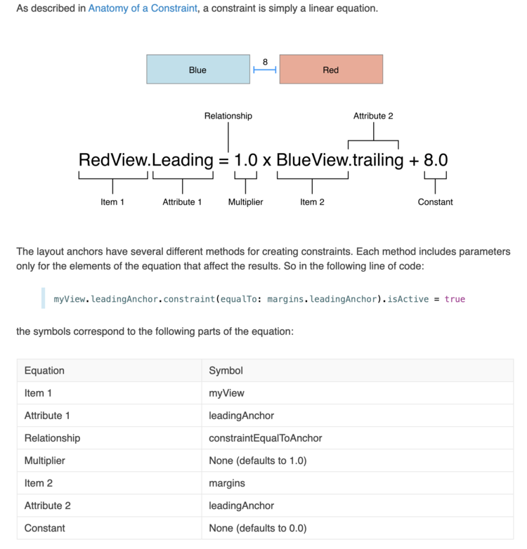
Luckily, as I knew what I wanted, I was able to quickly discover my answer in the Apple’s Documentation Archive: Auto Layout Guide under the Programmatically Creating Constraints page. On it they had an amazing diagram that showed two items close together, a labelled linear equation, an example line of code, and then they looped the previous pieces together in a grid so you could easily see how it all works together. I took a screenshot, below, so you’d have it readily available. While looking at the image I realized I should figure out the linear equation that I wanted to set and quickly jotted it down.

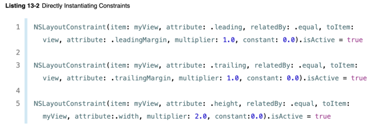
Further down on the same page they showed how to directly instantiate constraints using the NSLayoutConstraint class and I knew that that’s what I needed to do. Rather than use their example where they instantiated and activated the constraint all at once I instead broke it up a bit. This was the beginning of my solution.
My Solution
To create the constraints programmatically I knew I needed to access all three of the controls in question within my back end code. Specifically, I needed to connect the stack view, the label, and the scrollable view containing my text view to my code via an outlet.

To do this I made sure my storyboard file, showing the interface builder, is open. I next want the back end code, my view controller, open at the same time so I’ll need a split screen. You could click the icon at the top right to create a split screen and then make sure the proper files are open but I instead prefer to hold down the Option key and click my view controller in the Document Viewer to set it up. This process automatically creates a split screen with the previously opened file, in this case the storyboard, on the left and the newly opened file on the right. After making sure that the controls I want access to are centered on the left I get to work moving them into my code. I do this by first holding down the Control key, clicking on the control I want, and then, without releasing the mouse button, dragging the line that pops up to the view controller code. As you hold the end of the arrow above the code a caption will pop up saying Insert Outlet. Once you let go a popup appears allowing you to configure the properties before creating the connection (called an outlet). At the top of this popup will be a dropdown showing the type you can insert. Make sure this says Outlet rather than Action. You’ll be required to type in the name of your new outlet before clicking on Connect. I then repeated this process for the other two controls. If you want more information about Connecting Objects to Code you can check out Apple’s Documentation Archive: Xcode Overview: Building an User Interface.

Control key, clicked and dragged on the control I wanted to connect, and brought the end of the arrow to my code so I could insert an outlet.
Connect to add it.Once the three controls were connected to my code I quickly declared my two constraints right below them so they’d be able to be used in several locations within my class. I had planned to leave them uninstantiated but received an error as it
Expected member name or constructor call after type name
I couldn’t instantiate the constraint then and there with the outlets as they
Cannot use instance member ‘outlet(s)‘ within property initializer; property initializers run before ‘self’ is available
With both paths closed, for justifiable reasons, I decided to instantiate them without any arguments so they would each be a blank NSLayoutConstraint for now.

NSLayoutContraints I planned to use in the viewDidLoad function and elsewhere.// The three controls I'll need access to to create the constraints
// The stack view above the label
@IBOutlet var stackViewJSON: NSStackView!
// The label in question
@IBOutlet var lblLoadJSONmessage: NSTextField!
// The scroll view holding the text view; located under the label
@IBOutlet var textViewChangingJSON: NSScrollView!
// The two private constraints; temporarily instantiated to empty constraints
private var constraintScrollViewToStackView = NSLayoutConstraint()
private var constraintScrollViewToLbl = NSLayoutConstraint()Once that was done I went up to the viewDidLoad function to instantiate the constraints properly. Since this method is always called once the view is loaded I knew instantiating the constraints here would allow me to use the proper outlets and since this function is executed before anything the user could interact with I also know the constraints would be set before I could possibly toggle them on or off in the code. I overwrote both my private constraints, as they had both been set to blank values, with the new version using the proper outlets and then, since the label is hidden on load, activated the one constraint that covers up the label so the user wouldn’t be able to see where the label was once the application loads. Since the original constraint in my interface builder is removed at build time this new constraint won’t interfere with it.

viewDidLoad function I overwrote each of the two constraints with a new one using the outlets matched to my controls. I then activated the one constraint that hides the label from the user.override func viewDidLoad() {
// Allows the super class to handle it's code first
super.viewDidLoad()
// Set up the two constraints I want to toggle between
// This constraint sets the distance between the stack view and the scrollable text view thus hiding the label as the scroll view covers it up. Since there's a static constraint between the label and the stack view above it this essentially places the scrollable text view at the same place as the currently hidden label.
constraintScrollViewToStackView = NSLayoutConstraint(item: textViewChangingJSON!, attribute: .top, relatedBy: .equal, toItem: stackViewJSON, attribute: .bottom, multiplier: 1.0, constant: 6.0)
// This constraint makes space for the label as it positions the scrollable text view under the label instead of over it like the previous constraint.
constraintScrollViewToLbl = NSLayoutConstraint(item: textViewChangingJSON!, attribute: .top, relatedBy: .equal, toItem: lblLoadJSONmessage, attribute: .bottom, multiplier: 1.0, constant: 6.0)
// Both are inactive by default so I next turn on the one I want active on load
constraintScrollViewToStackView.isActive = true
}Two quick asides:
I call super.viewDidLoad() at the beginning of my viewDidLoad function so the superclass can handle it’s setup before I add my own. If interested you can read more about Why/When Do We Have To Call Super.ViewDidLoad? through izzi{Swift}.
While writing this post up I wondered it I could just add an initializer to my class and use that to initialize my already declared private constraints. I got the code compiling but when I ran my application it crashed
Thread 1: Fatal error: Unexpectedly found nil while unwrapping an Optional value
because my outlets were still set to nil as my view hadn’t loaded yet. I fixed it by returning my code back to how it was before as shown in this post. Specifically the blank initialization to the private constraint declarations and the proper initialization back to the viewDidLoad function.
Anyway once the two constraints were declared and properly instantiated it’s time to use them. To do this I moved down in my code to the function where I set my label to visible or hidden based on whether there’s an error message or not. If there’s an error message then the label needs to be visible .isHidden = false, the constraint that hides the label needs to be inactivated isActive = false, and the constraint that shows the label needs to be active isActive = true. If there isn’t an error message then the label needs to be invisible .isHidden = true, the string is set to blank .stringValue = "", the constraint that shows the label needs to be inactivated isActive = false, and the constraint that hides it needs to be activated isActive = true. Since you can’t have two competing constraints you’ll need to inactivate the currently active one before activating the other one. I went the opposite way in the else if section and got an error so I swapped the two lines.
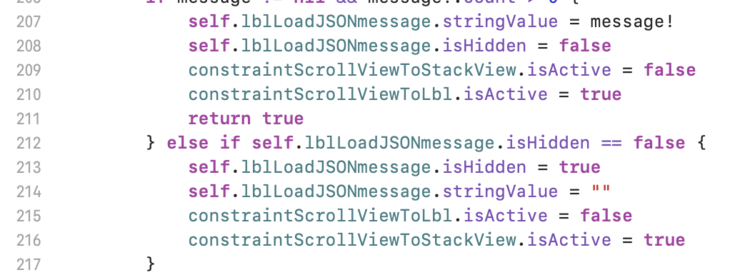
.isActive = false before activating the other constraint .isActive = true. This is the proper ordering.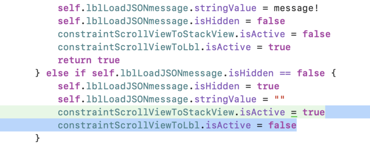
// When the label has a value and is set visible I deactivate the constraint that hides the label and then activate the constraint that shows it.
self.label.stringValue = message!
self.label.isHidden = false
constraintScrollViewToStackView.isActive = false
constraintScrollViewToLbl.isActive = true

// When the label doesn't have a value, as there's no error message, I set it to invisible, blank the string value, deactivate the constraint showing the label, and activate the constraint hiding it.
self.lblLoadJSONmessage.isHidden = true
self.lblLoadJSONmessage.stringValue = ""
constraintScrollViewToLbl.isActive = false
constraintScrollViewToStackView.isActive = true
With the constraints declared, instantiated, and activated (or inactivated) it’s time to test this out!


And with that the constraint went from a static immovable force on the interface builder to a dynamic one that fits my needs through the back end code. I was vaguely surprised at how amazing it worked and love how simple, in the end, it was to create. I wanted to share what I did with you in case you’re looking at creating something similar yourself.
If you do use this on your code I’d love to hear from you in the comments below to find out how it worked and/or how you used it. I hope your coding is going well and your day is great.
If you’re interested in getting any of my future blog updates I currently come out with a new one every Wednesday and share them to my Facebook page and Instagram account. You’re also more than welcome to join my email list located right under the search bar or underneath this post.
Did this save you time?

