
Announcing Simply Customize It!
Back when I first bought my reMarkable e-paper device I hopped onto Facebook and through several user groups fell into the world of custom templates and sleep screen images. Right after opening it I needed to figure out how to connect so I could change out its sleep screen with a custom image. I then worked on adding custom templates just because I could.
Through this I wrote several blog posts that I shared on my website here and with that received several questions through the comments, Facebook groups, and email. This ultimately led to me wanting to implement an Apple app to see if I could and, over the last several years, I used that app, while developing it, to restore my reMarkable after many updates, add custom templates, and change out several of my screens. Currently the app isn't in the App Store but it's close and I just released the iOS version to TestFlight, within the United States, if you want to try it out right away.
TLDR
I'm coming out with an iOS, and later potentially macOS, app that adds custom templates to your reMarkable and switches out the screen images without you needing to know how to use SSH . If you want to test it out it's in TestFlight here. Additionally the main page for this app can be found here.
Future Updates
I just created a new newsletter, called Simply Customize It, so you can sign up to get any future updates. If you're currently a member you've been auto-registered for this newsletter and if you aren't you can easily create a free account here.
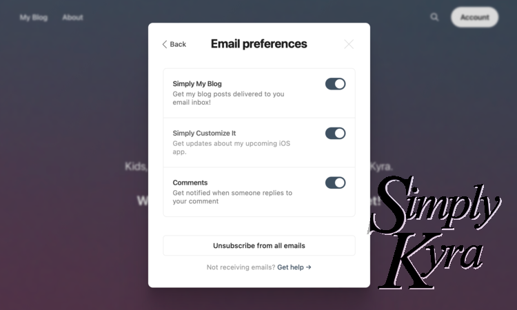
For more information about updating your email preferences check out this informational post that explains where to find it.
App Explained
This app, Simply Customize It, uses the SSH connection values, located within the Settings, to connect to your reMarkable and make the changes you want to make. It only connects when you press the button and doesn't work in the background when you're not expecting it.
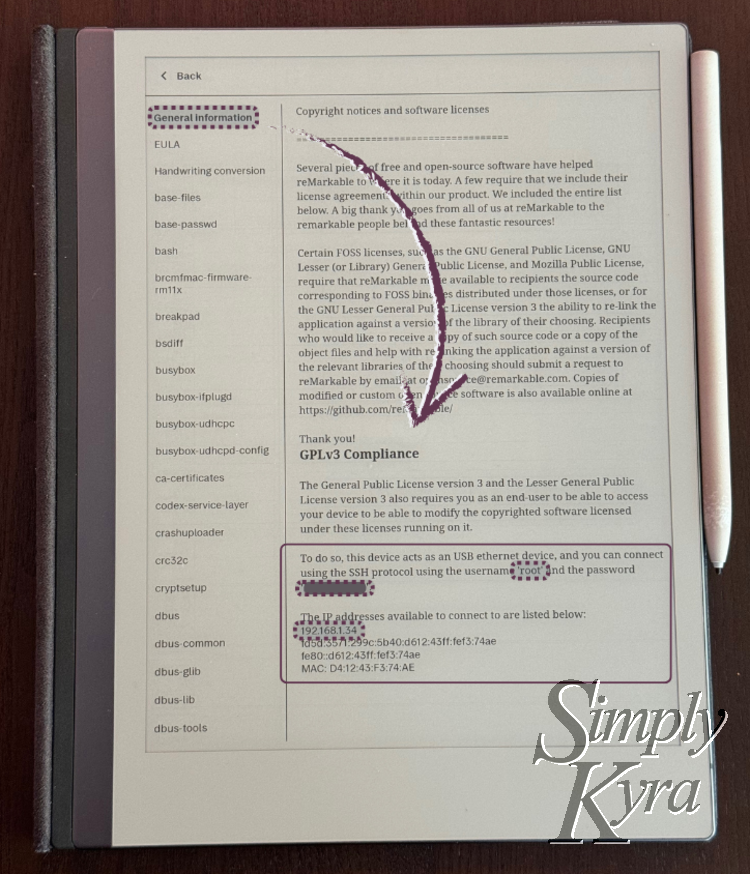
Warning: reMarkable doesn't officially support any custom changes to the reMarkable and, as such, it will lose the changes when the software updates.
That said, this app solves that problem by storing both the template and screen images for you and lets you update your reMarkable by simply pressing a button for either option.
Subscription
This app is planned to be offered under a subscription model where you can choose to have all access or limit the app to just the template or screen areas only. All plans will offer a trial. You can access the subscription from the Profile tab at any point and, if you don't have the subscription, from the template or screen tabs too.
Templates
The template tab shows three buttons that allow you to import the templates from your reMarkable into the app Import from Device, upload all the templates from the app to your reMarkable Upload Changes to Device, and finally Sync Device which basically imports first then uploads. I find upload works best when deleting something from the reMarkable, import if perfect when checking if reMarkable added anything, and sync I use most of the times.
Underneath that all the templates currently in the app are shown followed by their categories. At the very bottom there's a learn more to get more information about this area.
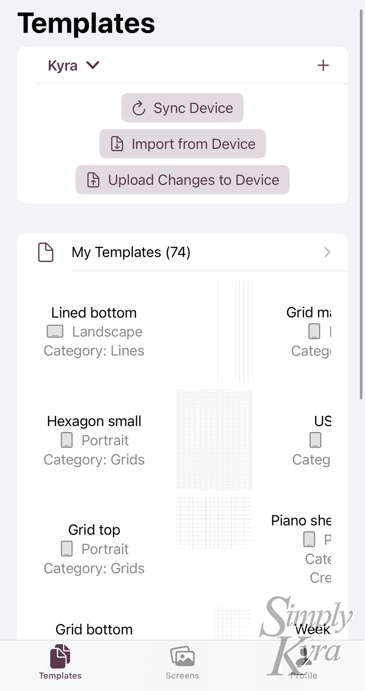
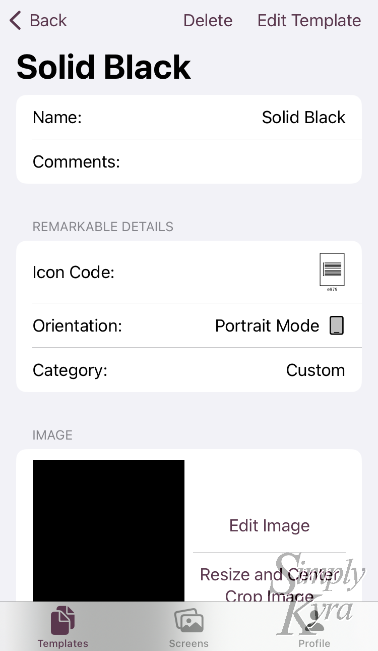
Each template itself has a name along with comments so you can mark any information about it you want to keep. This is stored along with the image itself and any details the reMarkable needs to know.
Screens
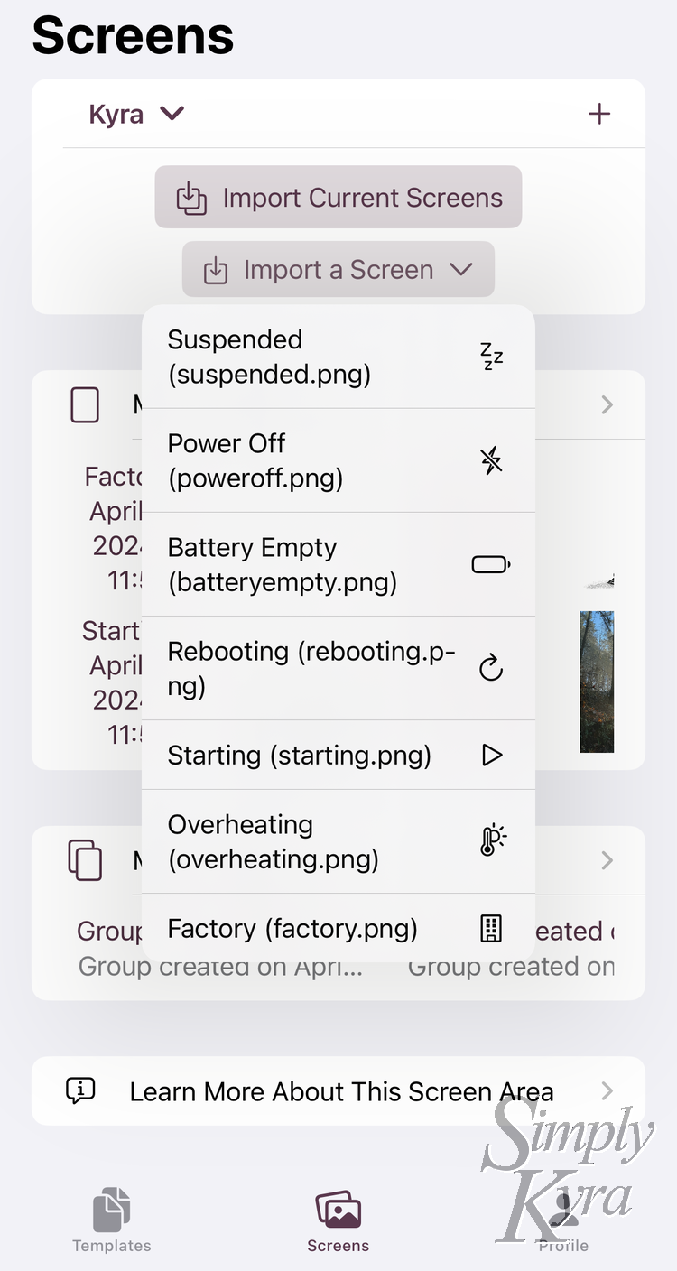
The screen tab keeps track of any current or potential screens you may want to use along with the option to import all the current reMarkable screens Import Current Screens or a single one Import a Screen.
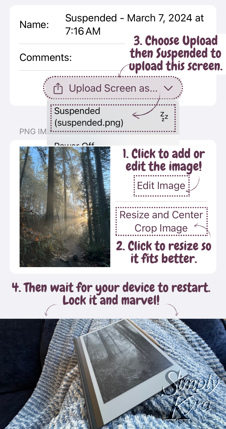
When setting a screen image the app essentially just replaces the default reMarkable image with our custom one so unlike the templates we don't need to store as much information. Each screen shows the same name and comment values that were used in the templates along with its image and a button to upload that image to the reMarkable.
In addition to the screens I created groups that store a set of screens. One of these are created when importing all the screens at once. You can also use it if you want to keep a matching group of screens together to upload all at once. Like templates, at the bottom, there's a learn more to get more information about this area.
Profile/Settings
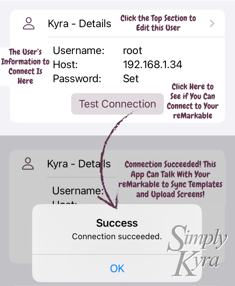
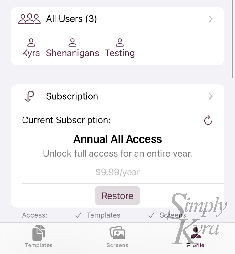
This tab isn't locked down under the subscriptions and is essentially the catch all for everything so it's pretty diverse. That said, its main purpose is to track the users. I used the user idea from the very beginning as both me and my husband have a reMarkable so I wanted to include a user entity so anyone could have separate template and screen sets they could switch between. I'm assuming most people will only have a single user created. That said, beyond storing the reMarkable connection details, which you need to be on the same WiFi to use, and a nickname so you can tell the users apart there's no other personal information stored about each user.
In this tab you can see the currently selected user along with a button to confirm that you can connect to its associated reMarkable. Below that you find a list of all the users in the app.
In addition to the users this tab also gives you access to your subscription and...
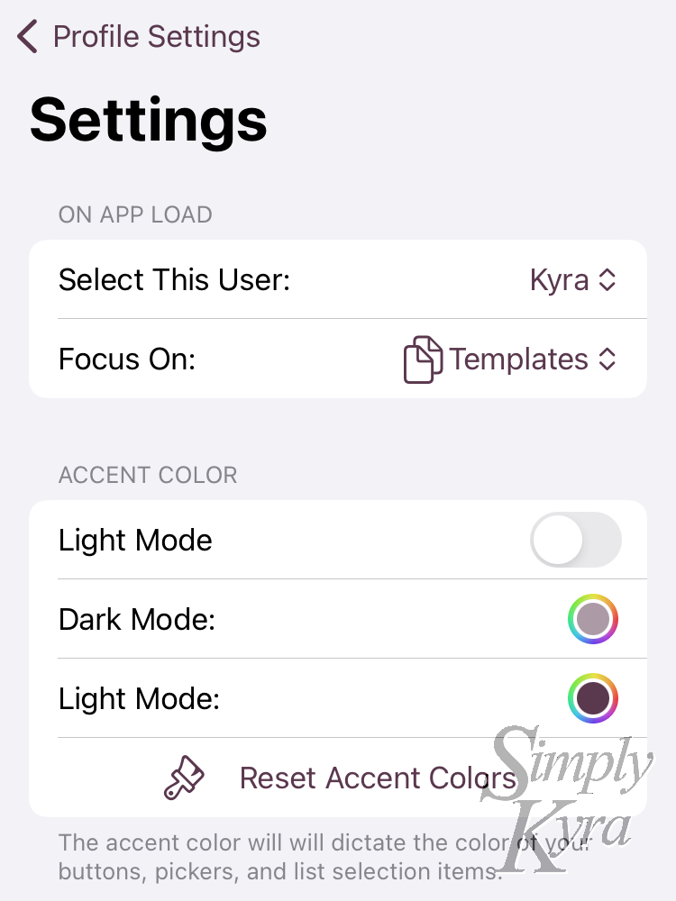
...allows you to alter default settings like which tab and/or user should be selected by default when the app loads along with whether the app should be in light or dark mode and which accent colors you prefer. These settings are device specific so if you share the app between multiple devices, all tied to the same iCloud account, each app can have different values set here.
When Will It Be Released?
This app has been years in the making and will come out soon. I feel confident enough to be able to offer the iOS version in TestFlight so if you want to check it out right away and test it you're welcome to it.
Future Development
Right now, on TestFlight, the app is only offered for iOS but the macOS version is mostly functional though not pretty. If there's enough interest in a macOS version I can prioritize it. Additionally the app is currently only offered in the US but I hope to open it up to more countries. This is my first app so I'd love to hear any legal tips to extend it to more countries so feel free to leave a comment or message me at mail@simplykyra.com if you have the experience to share.
And with all that I hope you’re having a great day!

