How To Make a Custom Picker with Multi-Selection in SwiftUI
Over the last several months I’ve been trying to get a custom controller working in my SwiftUI code that would allow me to select multiple items at once. I thought I had a solution and then realized it only worked when editing the main item and not when adding it from a blank page. This lead to me changing it up and I finally came across this solution. In case you’re also having similar difficulties I wanted to share my solution with you.
Quick aside: Unless mentioned any links below will direct you to the corresponding Apple Documentation page.
TLDR: If you want the GitHub Gist you can find it at the bottom.
Update
I’ve since updated this code to allow for Images by switching the String array to a struct. This means you can link any object you want to the Picker rows. If you’re interested in going beyond Strings then after checking this out you should check out the update here: Update to “My Custom Picker With Multi-Selection in SwiftUI” – Now With Images!
Backstory
A while back I realized I needed the ability to select multiple objects at once as I had a one-to-many relationship set on the CoreData object I was editing in my code. I assumed I could do this easily through the default Picker and was disappointed to find that I could not. After searching online I was excited to find a tutorial by Paweł Madej, titled Multi Select Picker for SwiftUI, and I quickly implemented it in my code. At first I thought it was perfect but after awhile I realized it only work properly for me when editing my CoreData object and not when I was adding a new one from a blank form. I spent some time trying to figure out a fix before deciding to try something new. I then came across a SwiftUI Multi-Select Picker gist by Aaron Dippner that I decided to implement and, if it worked, remove my earlier code. I couldn’t find an example where the struct was called but I was able to get it working within my code for both add and edit! I figured since I had so much trouble getting a functional picker with multi-selection working I should share my results with you. So here it is!
How It’s Coded
First, if you want the code example in it’s entirety I added the file to my SimplyKyraBlog GitHub repository and linked to it from the bottom of my ReadMe. This file assumes you created a new Multiplatform project and that you replaced the ContentView.swift file with its contents. The file itself contains four structs.
The first struct is the expected ContentView that declares an empty string array which will hold any selected items, selectedItems, along with a pre-filled string array of the items you can select from called allItems. It then checks if you’re running a macOS application or an iOS one so it can call the proper struct.
// Binding to the selected items we want to track
@Binding var selectedItems: [String]

var body: some View {
    Form {
        List {
            ForEach(allItems, id: \.self) { item in
                Button(action: {
                    withAnimation {
                        if self.selectedItems.contains(item) {
                            // Previous comment: you may need to adapt this piece
                            self.selectedItems.removeAll(where: { $0 == item })
                        } else {
                            self.selectedItems.append(item)
                        }
                    }
                }) {
                    HStack {
                        Image(systemName: "checkmark")
                            .opacity(self.selectedItems.contains(item) ? 1.0 : 0.0)
                        Text(item)
                    }
                }
                .foregroundColor(.primary)
            }
        }
    }
}
I’ll go over the next two structs, macOSview and iOSview, below. Before that; however, I wanted to go over the final struct in the file. This View will display the list of items, allItems, and allow the user to click to select or de-select them. I called it MultiSelectPickerView and this is the code that is mostly a copy of Aaron Dippner’s SwiftUI Multi-Select Picker gist that I mentioned in the previous section. It shows a list of Buttons, one for each item in allItems, that, when clicked on, adds or removes that item from selectedItems. The label for each button will display a checkmark if it’s in selectedItems and, either way, lists its name. This means when you click on an item without a checkmark it’s added to selectedItems and then a checkmark appears. If you click it again it’s removed from the selectedItems array and the checkmark disappears.
struct MultiSelectPickerView: View {
    // The list of items we want to show
    @State var allItems: [String]

    // Binding to the selected items we want to track
    @Binding var selectedItems: [String]

    var body: some View {
        Form {
            List {
                ForEach(allItems, id: \.self) { item in
                    Button(action: {
                        withAnimation {
                            if self.selectedItems.contains(item) {
                                // Previous comment: you may need to adapt this piece
                                self.selectedItems.removeAll(where: { $0 == item })
                            } else {
                                self.selectedItems.append(item)
                            }
                        }
                    }) {
                        HStack {
                            Image(systemName: "checkmark")
                                .opacity(self.selectedItems.contains(item) ? 1.0 : 0.0)
                            Text(item)
                        }
                    }
                    .foregroundColor(.primary)
                }
            }
        }
    }
}
I lied. I guess there’s one final struct… the ContentView_Previews that’s in every SwiftUI file that you’d want so you can preview the code. For the sake of showing everything here it is:
struct ContentView_Previews: PreviewProvider {
    static var previews: some View {
        ContentView()
    }
}
Also you’ll want to type in import SwiftUI at the top of your file.
The Custom Picker Made From a Button: macOSview
This is the code I started out implementing and it works great on both macOS and iOS. That said it displays the list of items to select from, the MultiSelectPickerView shown above, through a popover that looks great on the macOS but I don’t like it as much on the iOS simulator device. Here’s a Hacking with Swift example of a popover view if you want to see an animation. Anyway, when I run this on the iOS the popover takes up the full screen and needs to be pulled down from the top to exit which in my mind feels like a cancel rather than a set or a save so I went on to make an iOS version, shown in the next section, instead.
For the macOS version I implemented this within a HStack that displays a Text object, for the label, next to a Button that I want to appear like a Picker when closed. To appear like a Picker I implement, from left to right, a:
Spacerso everything following is on the far right of theButton- A count of the selected items using the system images of a number within a circle
- And finally a right chevron so it appears like a
Pickerand you can assume something will open when you click on it.
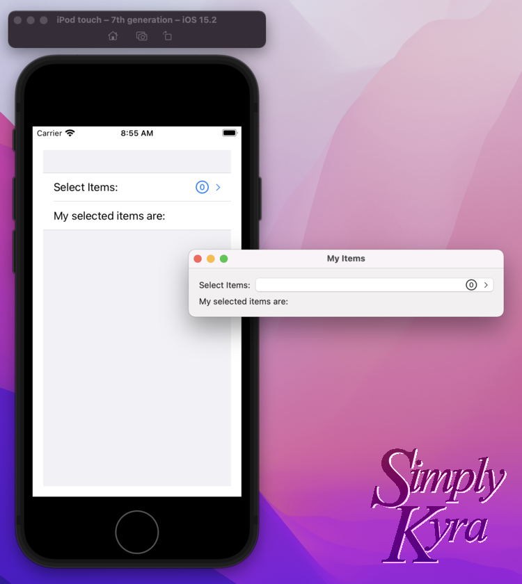
Below it, for this example, I created a Text object to display the contents of the selectedItems array more visibly. When run the Window is small and you’ll need to expand it depending on how many items you end up selecting otherwise you won’t see them all. The final result on the macOS, with custom colors, looks like:
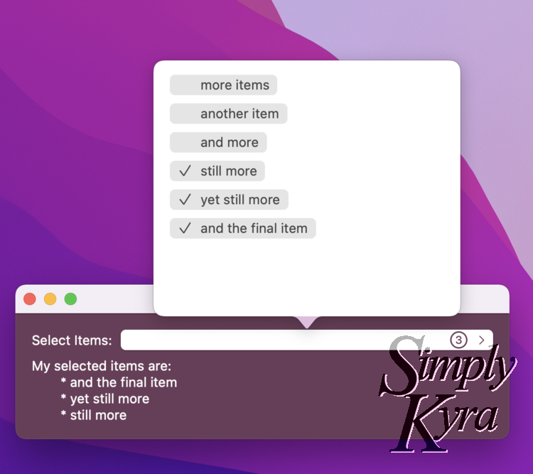
Button, that appears like a Picker, a popup appears above showing all the items that the user can select. When you click on one a checkmark appears so you know it’s selected. The checkmark disappears when you click on it again. On the Button itself you can see a count of the total number of items selected along with seeing them displayed on the left below the Button. When you click off of the popup it closes but the selected items still exist in the selectedItems array on the main View.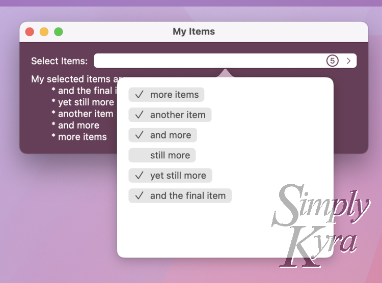
Window up to the top of the computer, so you’d assume there would be no room for the popup, the popup now appears below the button blocking the Text showing the selected items.As I said above the code will work on iOS in addition to the macOS example shown. In case you want to use this version on both devices I figured I’d show them together.
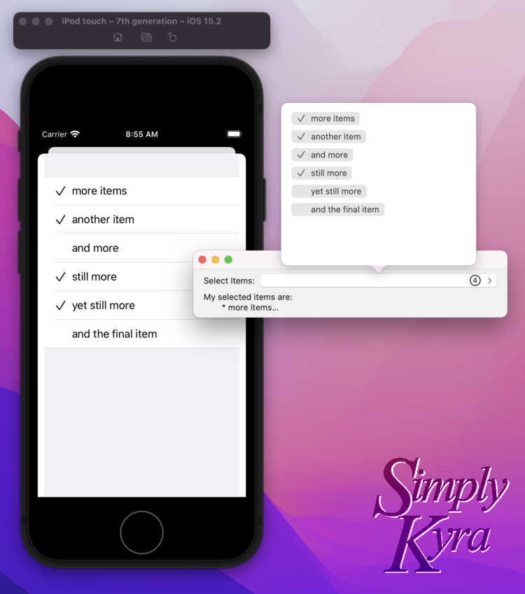
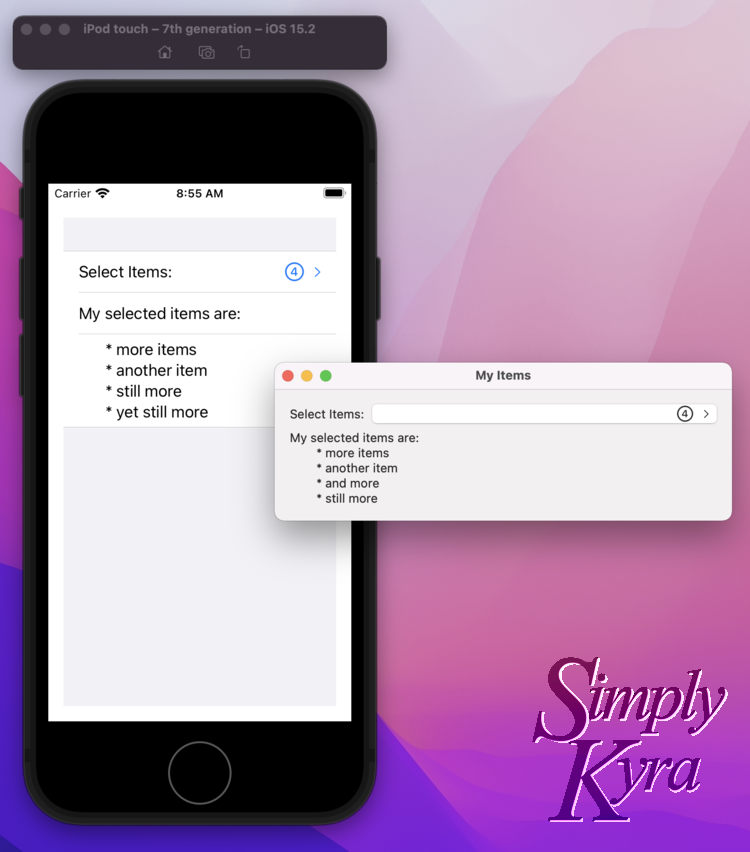
popover, in the device’s own way, you can see the selected items listed at the bottom along with the total count of selected items showing on the button itself.The code for this struct is:
// This View is functional on macOS and iOS; however, I prefer
// using a NavigationalLink for iOS rather than the popover so
// setting this one to macOS for this example
struct macOSview: View {
    @State var selectedItems:[String]
    @State var allItems:[String]
    // Needed to show the popover
    @State var showingPopover:Bool = false

    var body: some View {
        Form {
            HStack() {
                // Rather than a picker we're using Text for the label
                // and a button for the picker itself
                Text("Select Items:")
                    .foregroundColor(.white)
                Button(action: {
                    // The only job of the button is to toggle the showing
                    // popover boolean so it pops up and we can select our items
                    showingPopover.toggle()
                }) {
                    HStack {
                        Spacer()
                        Image(systemName: "\($selectedItems.count).circle")
                            .font(.title2)
                        Image(systemName: "chevron.right")
                            .font(.caption)
                    }
                    .foregroundColor(Color(red: 0.4192, green: 0.2358, blue: 0.3450))
                }
                .popover(isPresented: $showingPopover) {
                    MultiSelectPickerView(allItems: allItems, selectedItems: $selectedItems)
                    // If you have issues with it being too skinny you can hardcode the width
                     .frame(width: 300)
                }
            }
            // Made a quick text section so we can see what we selected
            Text("My selected items are:")
                .foregroundColor(.white)
            if selectedItems.count > 0 {
                Text("\t* \(selectedItems.joined(separator: "\n\t* "))")
                    .foregroundColor(.white)
            }
        }
        .padding()
        .background(Color(red: 0.4192, green: 0.2358, blue: 0.3450))
        .navigationTitle("My Items")
    }
}
The iOS NavigationLink: iOSview
I didn’t like how my Button and popover code looked on the iOS so I decided to implement it with a NavigationLink instead which needs to be housed within a NavigationView. Since I planned to only use this specific example in iOS, for you right now, I also housed either part within its own Section too.
Like before I linked to the same MultiSelectPickerView but as I was using a NavigationLink I assigned it to be its Destination. For the label I also used an HStack but this time I needed to include the label, as Text, and leave the chevron off as it’s included with the NagivationLink itself. Specifically, the label is:
Textobject as a label saying “Select Items:”Spacerso the label is on the far left and the image and chevron are on the far right- And finally the same system image as before using the
selectedItemsarray count so it shows the total items selected with a circle around it.
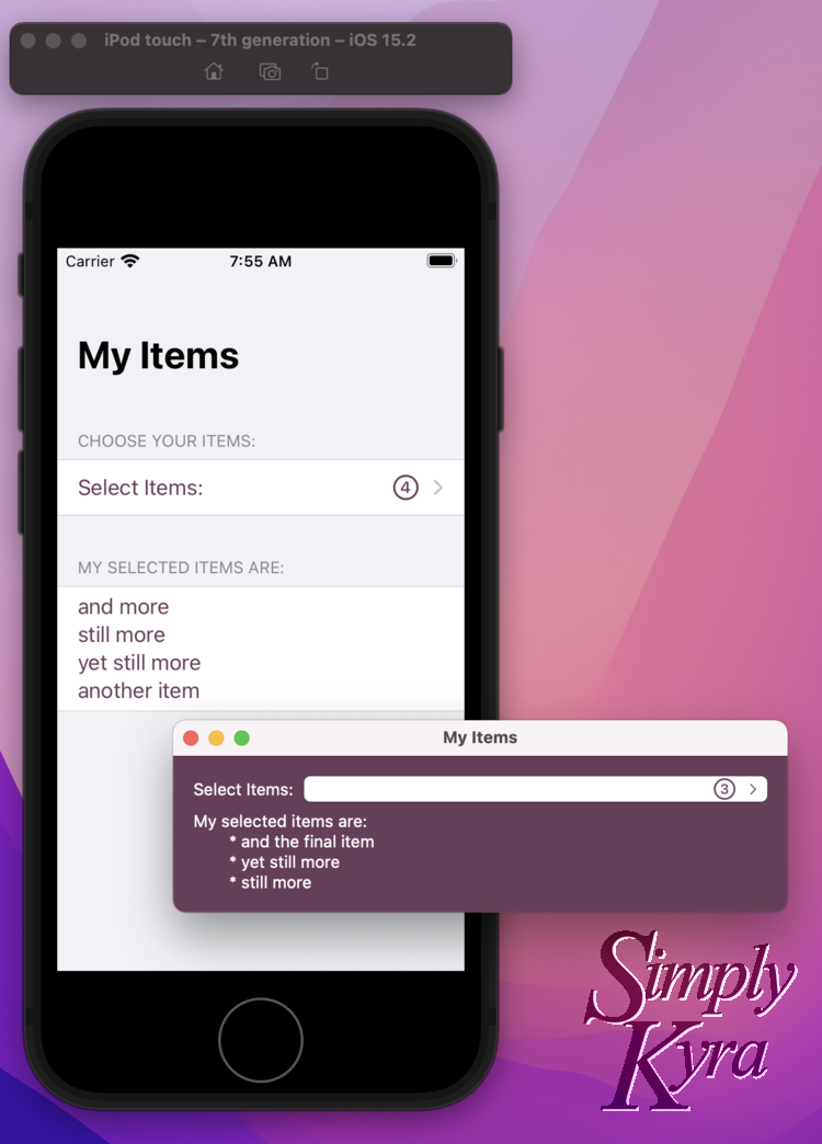
Like before I show a Text object with all the selected items displayed. This time I use the Section to encircle it so I don’t need a Text label above it. The final result on the iOS looks like:
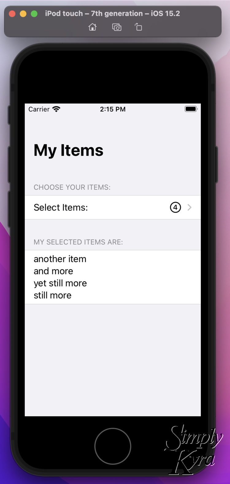
NavigationLink displays my Text label, a Spacer so the items are spaced out, and an image showing the total number of items currently in the selectedItems array. Since it’s a NavigationLink the chevron is automatically included in the secondary color too. Below, within its own section, I show the items that have already been selected.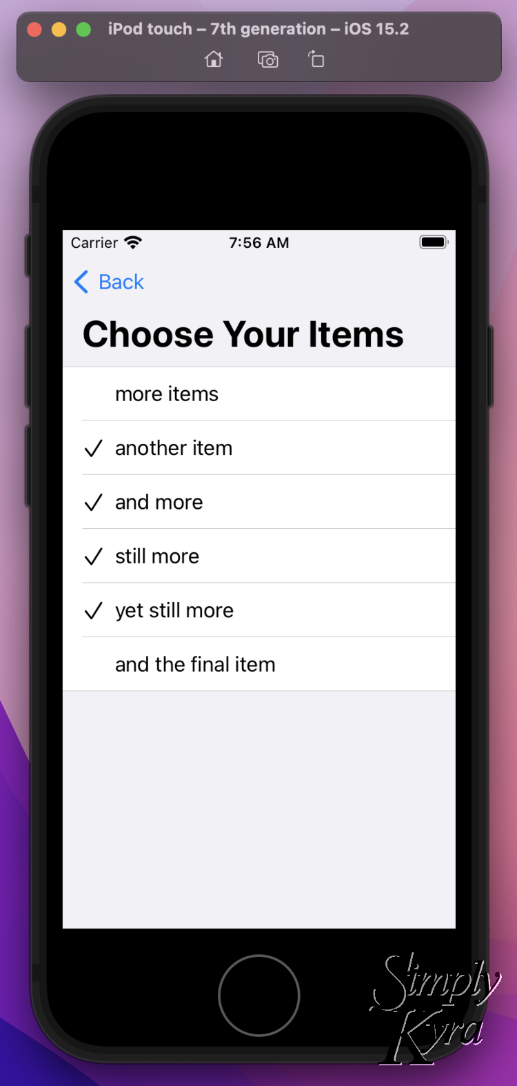
NavigationLink it opens a new screen showing all the items in allItems and lets me select, or de-select, each one as many times as I want. When done I click the Back button and I can see those selected items listed on the previous screen.Although I made this specifically for the iOS application it does also work, without changes, on the macOS too. Like before, in case you’d rather implement this, I included screenshots of both applications side by side running the same code.
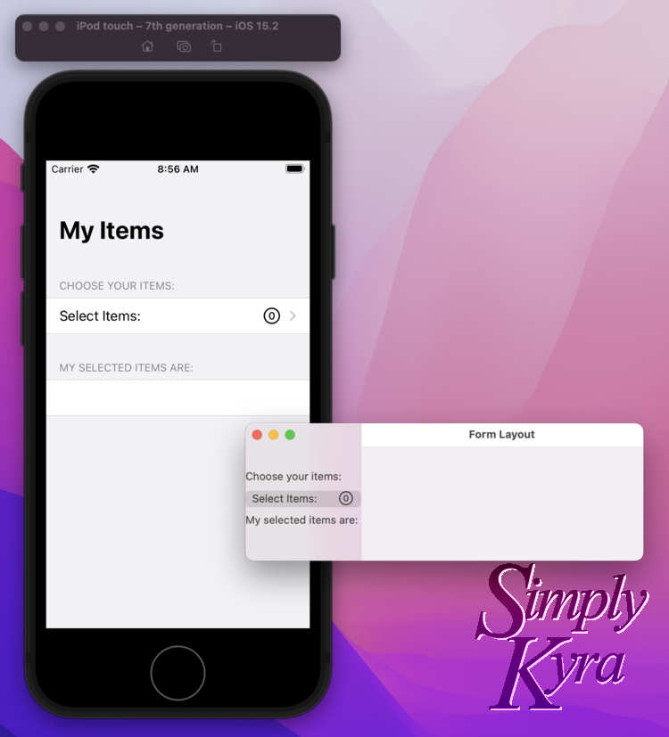
NavigationView the macOS version now has two panes side by side so once I click the NavigationLink the MultiSelectPickerView will always be visible on the right pane.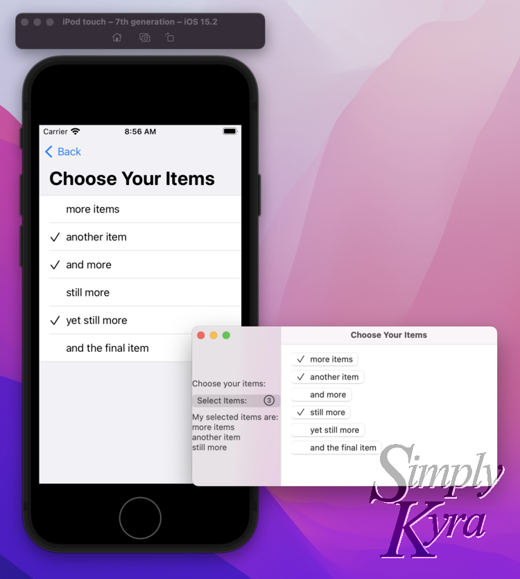
NavigationLink the iOS version on the left opens up to let the user choose the items. There’s a title and back button at the top to easily go back. In contrast the macOS window shows both and there’s no going back to having the right side blank.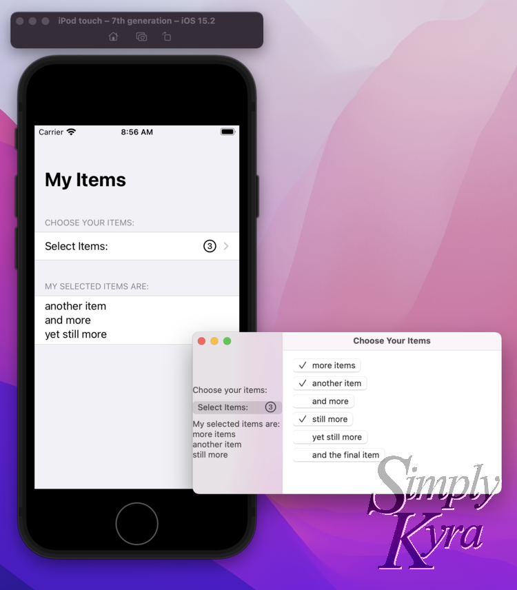
NavigationView, needed for the NavigationLink, created two panes in the window. That said, the selected items image and the text below updates whenever an item is selected or deselected in the right pane.The code for this struct is:
// The iOS version uses a NavigationLink that requires being
// in a NavigationView to work so I chose to move the entire
// thing into a new View.
struct iOSview:View {
    @State var selectedItems:[String]
    @State var allItems:[String]

    var body: some View {
        NavigationView {
            Form {
                // Since this is for iOS I included sections
                Section("Choose your items:", content: {
                    // Rather than a button we're using a NavigationLink but passing
                    // in the same destination
                    NavigationLink(destination: {
                        MultiSelectPickerView(allItems: allItems, selectedItems: $selectedItems)
                            .navigationTitle("Choose Your Items")
                    }, label: {
                        // And then the label and dynamic number are displayed in the label.
                         // We don't need to include the chevron as it's done for us in the link
                        HStack {
                            Text("Select Items:")
                                .foregroundColor(Color(red: 0.4192, green: 0.2358, blue: 0.3450))
                            Spacer()
                            Image(systemName: "\($selectedItems.count).circle")
                                .foregroundColor(Color(red: 0.4192, green: 0.2358, blue: 0.3450))
                                .font(.title2)
                        }
                    })
                })
                // Made a quick text section so we can see what we selected
                Section("My selected items are:", content: {
                    Text(selectedItems.joined(separator: "\n"))
                        .foregroundColor(Color(red: 0.4192, green: 0.2358, blue: 0.3450))
                })
            }
            .navigationTitle("My Items")
        }
    }
}
One Issue
I’ve since noticed an issue with the layout when combining the macOS control with a TextField or regular Picker within a Form. It’s as if, since those controls have a built-in label, SwiftUI sets up two columns so the label goes in the first and the white textbox or combobox goes in the second one. When I add an HStack, with the Text, Spacer, and Button, the entire thing is put in the second column and there’s a blank space under the other labels for its row.
I couldn’t figure this out and ended up posting a question on StackOverflow, Customize the SwiftUI Form label layout for MacOS, and had help from ChrisR that got me to a solution… I thought. Then I realized the label and button were still slightly off, although spread out over both columns, and I couldn’t make the form skinner than about 20 to 30 pixels. I can make the form as wide as I want but can still only shrink it down a bit from whatever width I’m at. This means the macOS window will eventually get as big my mouse can make it if I keep fiddling with it. I’ve since posted this question, in more detail, in a new StackOverflow post, SwiftUI MacOS Form Custom Layout, so if you want to help tackle it feel free to join me there.
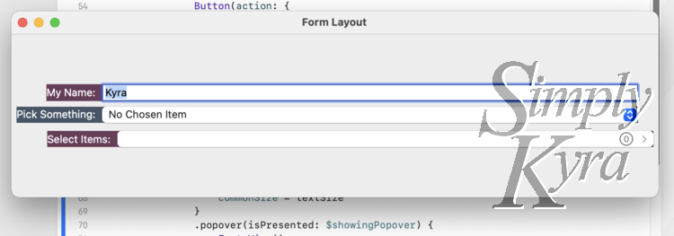
Text/Button layout working like the TextField and Picker above is this.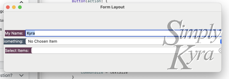
Picker on the right. If I make the window way bigger I can still only bring it in this much so eventually it gets really wide.In the second question ChrisR recommended setting a fixed width for them as Buttons and Pickers look funny if too wide. I’ve considered doing that but I really want the user to be able to resize the window to whatever they’d like with the knowledge that the controls will follow along. Plus I want the labels and control edges to perfectly line up.
If you have any tips I’d love to hear it in the comments below or on the StackOverflow question.
Conclusion
I love how functional this code is (even if the layout is lacking) and how it works for me whether I’m displaying already saved and loaded data or having a user create the data from a blank form. If you’re interested in using it the code in it’s entirety is saved to my SimplyKyraBlog GitHub repository and, if you want a direct link, the file CustomMultiSelectionPicker.swift is here.

As a quick aside if you’re interested in including custom colors, like in the above photo, I recently wrote a post that explains how I go from a color’s hex number to a custom SwiftUI Color perfect for my code. Check it out here!
Also if you’re interested in using a struct rather than a String, allowing for images, check out: Update to “My Custom Picker With Multi-Selection in SwiftUI” – Now With Images!
The Code
If you just want the code here's the public Gist
I hope you’re having a great day and this code can help you! If it does I’d love to hear what you’re working on and how it helped so feel free to share in the comments below. If you have any way to improve it I’d also love to hear. I hope you’re having a great day.
If you’re interested in getting any of my future blog updates I currently come out with a new one every Wednesday and share them to my Facebook page and Instagram account. You’re also more than welcome to join my email list located right under the search bar or underneath this post.
Did this save you time?

